 The Nike swoosh. The Golden Arches. The Target, ummm, target. Three images that are synonymous with their brand. Great logos and brand recognition aren’t just for big businesses. Small businesses can benefit from a resonant logo too. An impactful logo has the power to build trust, to tell clients who you are, what you do, and the benefits you offer. Your logo is one of the first interactions people have with your company, that all-important first impression. Your logo communicates brand identity, ownership, quality, and value. The real trick is to create a lasting impression that is more than just an eye-catching logo. Focusing on the following tips can get your logo brainstorming headed in the right direction.
Choose the right font:
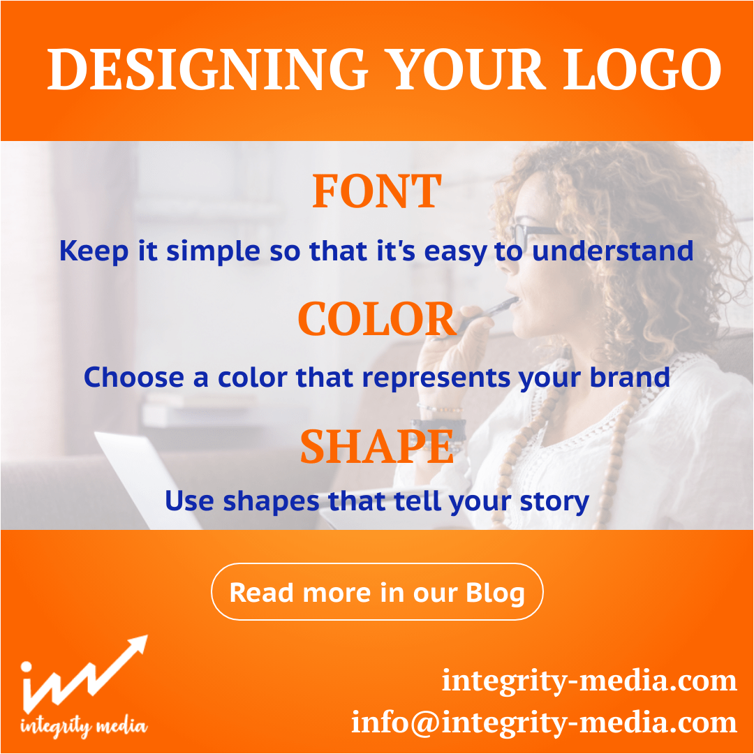
A logo needs to be clear and easy to understand to connect with consumers. Keeping it simple helps a logo work across multiple media platforms and in any size. People recall a word more by its looks than what it says. Your logo should elicit an emotional connection to increase the chances of your brand becoming memorable. Use a font that communicates your personality. The company name should be clear and legible if you are using it in the logo. Consider a logo’s functionality. If you plan to use the logo on a website, business card, or on the packaging, it needs to be instantly readable. If the name and the font you select check off all the boxes for representation, communication, and appeal, you are off to a great start.
Color:
Did you know that color can improve brand recognition up to 80%?
Select a color that represents your brand, a color to be remembered. Pick colors based on the feelings you want consumers to feel and what you want them to do. You want to choose the right color for your industry. For example, if you work in the financial services industry, blue may be good as it represents trust. Integrity Media chose blue exactly for this reason. We are a trusted advertising firm, and we communicate that through our choice of color.
Your color (or colors) should tell a story. According to research, about 25% of people say it is easier to remember a brand based on the color.
Color is psychology. A quick search can point you to many reputable sites which correlate colors to industry to the desired response. Also, stick to solid colors rather than gradients.
The shape of your logo:
Consumers take only 10 seconds to memorize a logo and start thinking about it.
Visual elements help and make a logo memorable. For example, an auto repair shop might use a tire as an idea for a logo because some quick research shows circles and ovals tend to project a positive emotional message. Do a google search on the psychology of shape. Also, try integrating the business name into the shape. Add some blue and suddenly your logo is one of a trusted mechanic that people can feel good doing business with. Be creative, play around with shapes, letters, and colors, and find the right combo for your brand.
Now that you have the logo it is all about being consistent and getting your brand out there. Over time consumers will create an association between your logo and brand. Who knows, maybe one day you can be as recognized as Nike, McDonald’s, or Target.
Have questions?
Contact the Integrity Media team. Put our 25 years of marketing experience to work for you. Your free consultation is just a call or email away

